Key Features
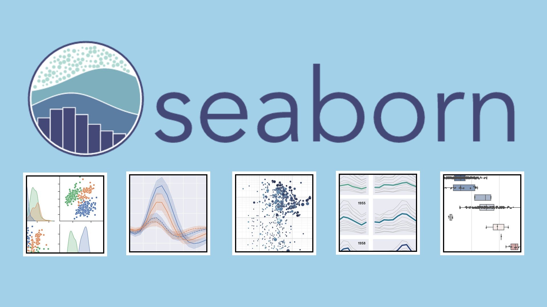
Statistical Plots
Create bar plots, box plots, violin plots, and histograms with built-in statistical aggregation.
Relational Visuals
Use `relplot`, `scatterplot`, and `lineplot` to explore relationships between variables.
Regression Analysis
Visualize linear and logistic regression fits with confidence intervals using `regplot` and `lmplot`.
Themes & Palettes
Apply built-in themes, color palettes, and context settings for publication-ready visuals.
How It Works
Install & Import
Use `pip install seaborn` and `import seaborn as sns` to get started.
Load Data
Use Pandas or built-in Seaborn datasets like `tips`, `iris`, or `penguins`.
Choose Plot Type
Use functions like `sns.barplot()`, `sns.heatmap()`, or `sns.scatterplot()`.
Customize Style
Set themes with `sns.set_theme()` and adjust axes, legends, and colors.
Render or Export
Use `plt.show()` or `plt.savefig()` to display or export your chart.
Code Example
# Seaborn Bar Plot Example
import seaborn as sns
import pandas as pd
import matplotlib.pyplot as plt

df = pd.read_csv("sales.csv")
sns.barplot(x="Region", y="Revenue", data=df, palette="viridis")
plt.title("Revenue by Region")
plt.show()
Use Cases
Exploratory Data Analysis
Quickly visualize distributions, relationships, and outliers in datasets.
Model Diagnostics
Plot residuals, regression fits, and feature relationships for ML models.
Statistical Reporting
Generate publication-quality charts for research and presentations.
Dashboard Embedding
Render charts in notebooks or web apps for interactive analysis.
Integrations & Resources
Explore Seaborn’s ecosystem and find the tools, platforms, and docs to accelerate your workflow.
Popular Integrations
- Pandas, NumPy, Matplotlib
- Jupyter, Colab, VS Code
- Scikit-learn, Statsmodels
- Dash, Streamlit, Flask
- SVG, PNG, PDF export
Helpful Resources
FAQ
Common questions about Seaborn’s capabilities, usage, and ecosystem.
